Compliance in the system
Building for Accessibility in our Design system
Building for Accessibility in our Design system
YEAR
2022
CATEGORY
ARTICLE
ROLE
TEAM DIRECTION/INCLUSIVITY EVANGELIST/DESIGN SYSTEMS
ORGANIZATION
GOJEK
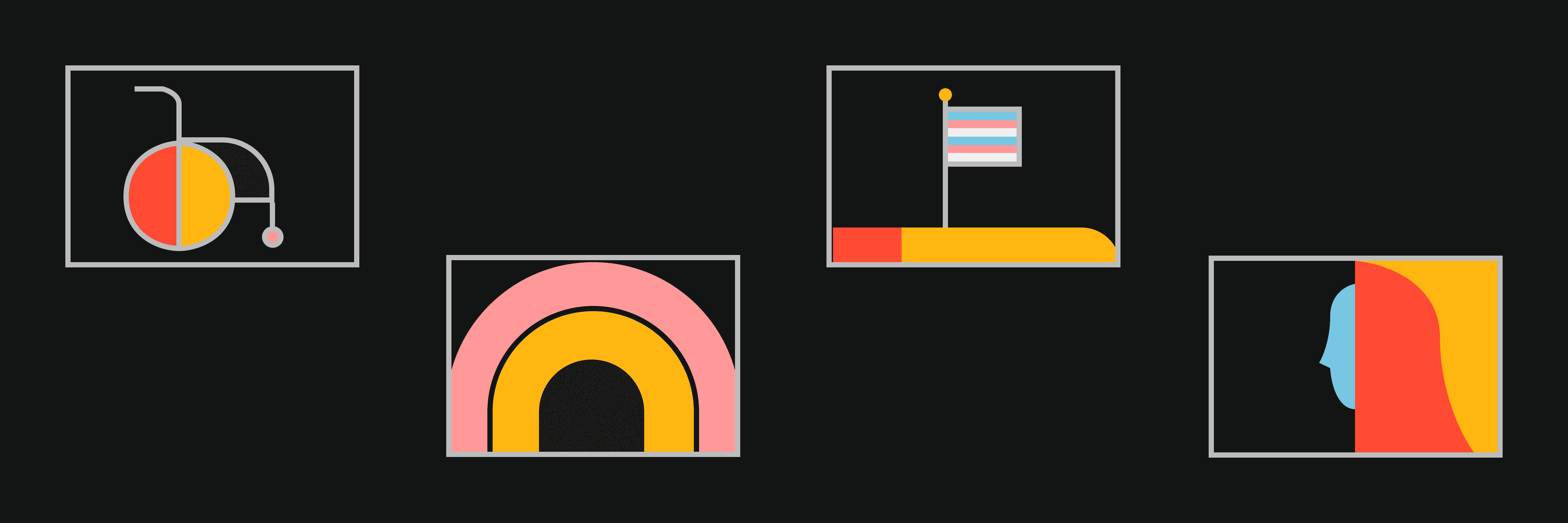
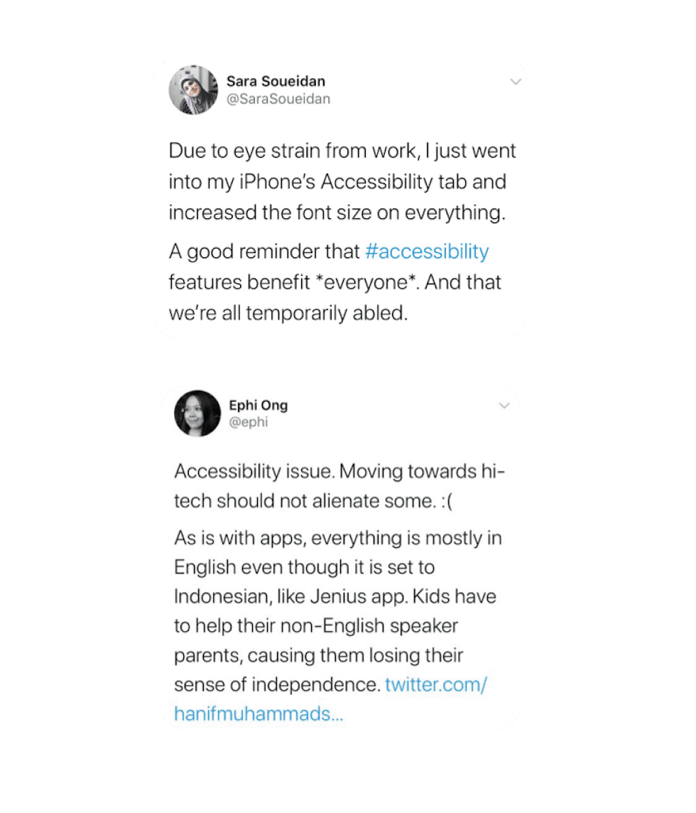
Gojek gets more than a 100 million users per day. They vary in ages, tech knowledge, frequency of usage etc. In Indonesia alone, 8,56% of citizens have some form of disability. That’s 21,8 million people, and almost half of those have double disabilities (SUPAS 2015). Till now we’ve not designed for disabilities, either temporary or permanent. This leaves a major part of the users struggling to use our app.
We’d like to think that Gojek isn’t just for those with perfect eyesight, hearing or tactile ability. If anything, Gojek should make life easier for users, regardless of disabilities. Having a disability, chronic illness or another special need shouldn’t limit your ability to participate fully in activities other people may take for granted.
a11y is a numeronym for Accessibility where the number 11 refers to the number of letters omitted.
Designing with accessibility in mind means we are following our a11y principles:
Become an a11y
CLEAR -
Help users navigate by designing clear and easy layouts with distinct calls to action. Enabling familiar, consistent interactions that make complex tasks simple and straightforward to perform.
OPERABLE -
Supporting assistive technologies and personalisation. Designing Gojek to adapt to environmental variations, such as device orientation, screen size, resolution, etc.
ROBUST -
Designing Gojek to accommodate a variety of users. We want people to enjoy Gojek in any context and on all supported devices.
Home
Stories
Play
About
We are taking various steps to ensure that Gojek as a product provides delightful experience to all our users. These are the steps -
We ensure that the colours used in our component and UI pass the WCAG guideline for AA standard. It is not recommended that Level AAA conformance be required as a general policy for our entire UI because it is not possible to satisfy all Level AAA success criteria for some content.
For the same purpose, we have modified the current colour palette coming from the branding guidelines to comply more wit colour contrast. We have a separate palette that we implement in our components, to be used in the UI. Although the palette is new, the base shades are still compliant with the ones coming from branding, since we want to ensure that the synergy between the branding, marketing and the actual app UI is maintained.
As mentioned before, we have created themes based on the overall product categories in Gojek; Consumer(Green), Merchants(Purple) and Third party apps(Pink). This is just one of the examples -
Ensure 95~100% of our UI passes WCAG 2.0 Color contrast ratio value
Currently, our colours pass majorly AA standards. AAA pass for title, body, and caption tokens but only on background colours not on the coloured fills including active/primary.
With a High Colour contrast tokens set we aim to push the benchmarks for minimum contrast of 7:1 and above i.e. passing AAA standards for:
Fill colours that are generally used in combination with text
Icon colours since icons are often actionable
High contrast mode for our tokens
Haptics falls under the field of kinaesthetic communication, which focuses on tactile contact as a form of communication. It refers to the sensation delivered to users through a touch UI. It is generally linked with audio and visual feedback in key interactive moments. You can synthesise haptics by configuring parameters like haptic intensity and sharpness. Each event starts at a specific time, with its own specific parameters, like haptic intensity and sharpness for haptic events, or audio volume and pitch for audio events[3]. This helps in simulating the real world in onscreen interfaces. It creates an interactive and immersive experience. Some of the examples of haptic feedback that we are building into our system are -
Success Notification
Indicates that a task or action has completed
Error Notification
Indicates that a task or action has failed
Warning Notification
Indicates that a task or action has produced a warning of some kind
Selection Feedback
Indicates that a UI element’s values are changing
Heavy Impact
Indicates a collision between large or heavyweight UI objects
Medium Impact
Indicates a collision between medium-sized or medium-weight UI objects
Light Impact
Indicates a collision between small or lightweight UI objects
Provide haptic feedback as a way to build affordance
Provide a new scale with bigger base size to address readability issues in driver/consumer app, as well as support dynamic resizing of text, based on user preference
Improve our existing text style library to support better readability
Ensure that our components support screen reading and talk back functionalities for blind/partially sighted people
Support for screen reader and talk-back
Create and maintain libraries for light and dark mode for aloha components. Provide a switch on the UI to toggle themes
Support for theming in Asphalt Aloha
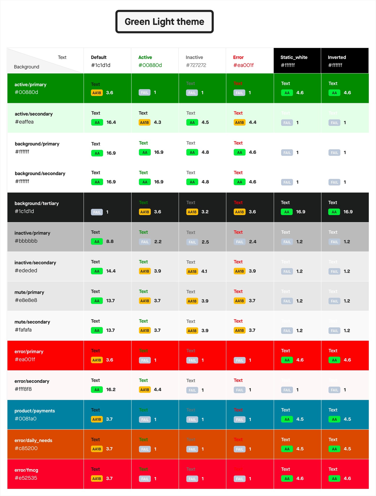
Image courtesy Keith Vaz, Manyu Varma
Coming soon !
All these efforts are slowly showing their impact in the form of quantitative as well as qualitative numbers. Here is an example where within 7 days, almost 45% of MAU (Monthly Active Users) who launched Gojek with VoiceOver property confirmed booking.
We have many more user stories coming in where building for inclusivity and accessibility has bought a positive impact to Gojek as an org. This has helped us become stronger evangelists within the product org and get more teams onboard to these initiatives
Seeing the impact
Seeing the impact